TL;DR
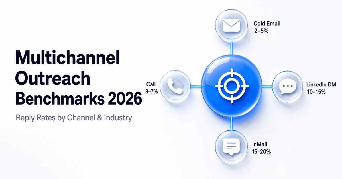
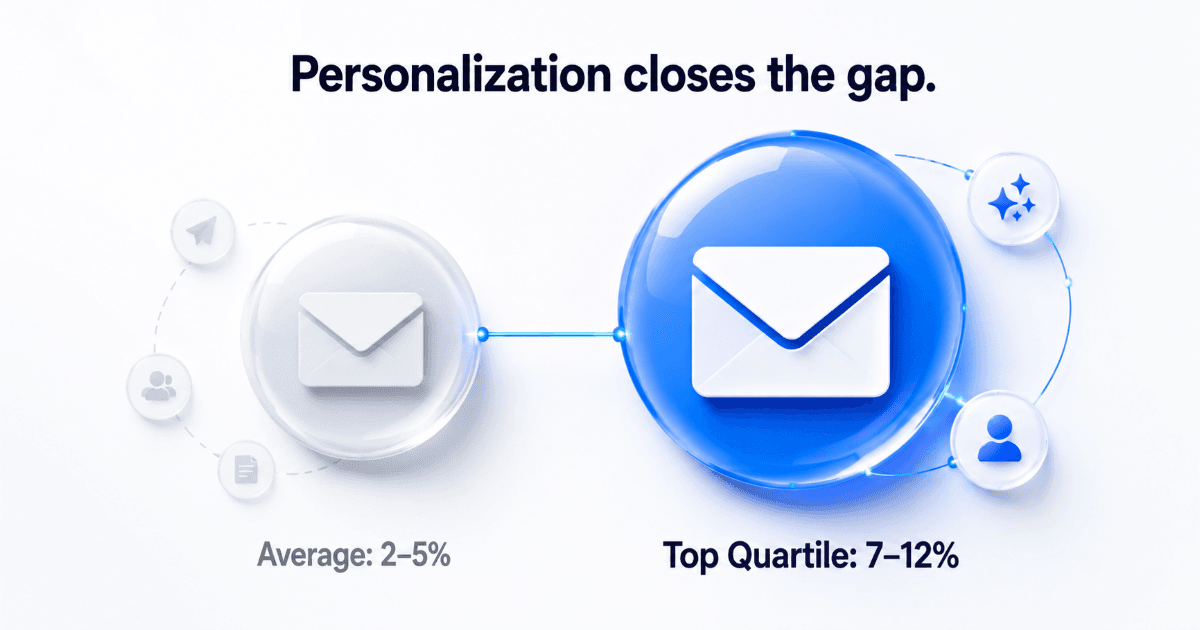
- Cold email reply rates average 2–5% across B2B — top-quartile teams consistently reach 7–12% with strong personalization and deliverability.
- LinkedIn DM to connections averages 10–15%; InMail outperforms at 15–20% when subject lines are sharp and profile match is tight.
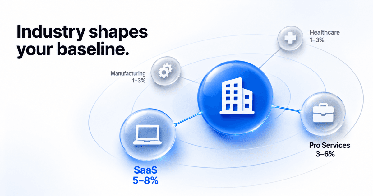
- Industry matters as much as channel — SaaS email reply rates run nearly 3× manufacturing on the same message quality.
- The most common benchmarking mistake: blending channel metrics into one number and comparing it to averages from a completely different vertical.
- A well-run five-touch multichannel sequence in 2026 should produce a combined 18–28% reply rate — not from one touch, from the full sequence layered correctly.
Most outbound teams are measuring themselves against the wrong number. They found a stat — "the average cold email reply rate is X%" — in a blog that aggregated every vertical, every personalization level, and every level of list hygiene into one tidy figure. Then they use it to judge campaigns that look nothing like that sample.
This is the reference that should have existed years ago: multichannel outreach benchmarks by channel and by industry, consolidated in one place, built for 2026 realities. Use it to calibrate what good actually looks like for your specific motion — before you panic about a number that might be perfectly healthy, or celebrate one that should be significantly higher.
Why Benchmark Numbers Are Almost Always Used Wrong
There's a foundational problem with how most teams apply reply rate benchmarks: they strip the context and keep the number.
A 3% email reply rate drawn from a study covering every B2B vertical, every personalization approach, and every point on the list quality curve tells you almost nothing useful about whether your own 3.1% is a red flag or a reasonable baseline. Reply rate is a composite metric — it reflects deliverability (does your email reach the inbox?), relevance (does the message fit this person right now?), timing (are you catching them at the right moment?), and channel fit (is email even where this persona operates?). Strip those variables away and the number becomes noise dressed up as insight.
Three variables that shift every benchmark
The denominator definition. Some teams calculate reply rate against emails sent. Others use emails delivered. Others use unique opens. These produce wildly different numbers from the exact same campaign. A 5% open-to-reply rate and a 5% sent-to-reply rate are not remotely the same performance — and most published benchmarks don't specify which denominator they used.
The personalization level. Mass-blast campaigns — identical messages to thousands of contacts — produce sub-2% reply rates as a rule. Hyper-personalized sequences with custom first lines, buying signal triggers, and tight ICP targeting regularly hit 8–15%. Most benchmark studies freely mix these two populations, producing a middle number that describes neither well.
The temperature of the list. Cold contacts — first-touch, no prior relationship — perform fundamentally differently from re-engagement lists or inbound-influenced prospects who already know the brand. A benchmark built on a mix of both will understate performance for cold and overstate it for warm. The benchmarks in this piece cover cold outreach only. That's the hardest version and the most honest starting point.
Reply Rate Benchmarks by Channel (2026)
Each channel operates under different audience expectations, different levels of inbox saturation, and a different threshold for what counts as a "reply." Here is what the data says about each, and what it actually means for your outreach motion.
| Channel | Average Reply Rate | Top-Quartile Rate | Primary Performance Driver |
|---|---|---|---|
| Cold Email | 2–5% | 7–12% | Deliverability + personalization depth |
| LinkedIn Connection Request | 25–35% acceptance | 40–50% acceptance | Profile completeness + connection note relevance |
| LinkedIn DM (to connections) | 10–15% | 18–25% | Timing after connection + message relevance |
| LinkedIn InMail | 15–20% | 25–30% | Subject line + active LinkedIn presence of recipient |
| Cold Call (connect rate) | 3–7% | 12–18% | Call window timing + local presence dialling |
What these numbers actually mean in practice
Cold email is the highest-volume, easiest-to-launch channel — which is exactly why it is the most saturated. The 2–5% average includes every team running blasts to unverified lists without personalization, to mis-targeted personas, with no inbox warming in place. If your deliverability is healthy, your ICP is tight, and your first lines are genuinely personal, a well-matched cold email list should produce 6–9%.
LinkedIn InMail consistently delivers the highest raw reply rate of any cold outreach channel — but it is credit-limited and does not scale at email volumes. Teams hitting 25%+ InMail reply rates are targeting prospects who are actively posting on LinkedIn and writing subject lines that connect directly to that person's current role, recent activity, or visible initiative. Generic InMail performs closer to the 10% floor.
LinkedIn DM to connections is the channel that scales most efficiently for teams running multichannel outreach sequences. Once a connection is accepted, the conversation dynamic shifts entirely — you are messaging someone who has already acknowledged your existence. That is a fundamentally different starting point than a cold email, and the reply rate reflects it.
Cold calling has the lowest average connect rate of any digital channel, but the highest conversation quality when contact is made. Teams using phone as a third or fourth touch — after email and LinkedIn have created name recognition — see connect-to-meeting rates that regularly outperform pure email sequences. Phone as a first touch into a cold list almost never justifies the volume required.
One important note on LinkedIn connection requests: a 30% acceptance rate is not a 30% reply rate. It is a prerequisite — the door opening, not the conversation starting. Count acceptance separately, and only measure reply rate on the DM step that follows.
📊 Channel performance snapshot
- LinkedIn InMail delivers 3–4× the average reply rate of cold email — 15–20% vs. 2–5% on comparable cold lists
- LinkedIn DM to connections is roughly 3× more likely to get a reply than a cold email sent to the same person
- Top-quartile cold call teams reach 12–18% connect rates using optimized call windows and local presence dialling — not raw volume
- Cold email top-quartile (7–12%) is only achievable with a clean inbox, a verified list, and genuine first-line personalization — not template sends at scale
Reply Rate Benchmarks by Industry (2026)
The channel table tells you what is possible. The industry breakdown tells you what is realistic for your specific target market. These two dimensions together are what make a benchmark genuinely useful — and what almost every published benchmark guide fails to deliver.
An outbound team selling into SaaS companies is operating in a completely different engagement environment than one selling into manufacturing. Same message quality. Same tools. Completely different results — because the audience, their relationship with digital channels, and their tolerance for cold outreach are different at the structural level.
| Industry | Cold Email Reply Rate | LinkedIn DM Reply Rate | Strongest Channel | Key Reason |
|---|---|---|---|---|
| SaaS / Tech | 5–8% | 12–18% | LinkedIn DM | Digitally native buyers, active LinkedIn presence |
| Professional Services | 3–6% | 10–15% | LinkedIn DM | Relationship-driven buyers who are active on LinkedIn |
| Financial Services | 2–4% | 8–12% | LinkedIn InMail | Compliance caution drives lower cold email trust |
| Healthcare | 1–3% | 6–10% | Phone (after email) | Long cycles, administrative gatekeepers, low inbox monitoring |
| Manufacturing | 1–3% | 5–9% | Phone | Low digital channel engagement, phone-first decision makers |
| Retail / eCommerce | 2–4% | 7–11% | Email (segmented) | Email-native buyers — segmentation quality determines standout |
The SaaS-to-manufacturing gap is not a messaging problem
SaaS buyers are digitally native. They check email regularly, they are active on LinkedIn, they have seen cold outreach before and know how to respond to a well-crafted message. A thoughtful, personalized pitch in the right channel reaches the right person. A 5–8% cold email reply rate into this vertical is achievable with genuine personalization and solid deliverability hygiene.
Manufacturing operations directors and plant managers operate in a different world. Many receive fewer cold emails than their SaaS counterparts — but they are not checking LinkedIn between meetings and they handle most business communication by phone or in person. A better email does not solve a channel fit problem. A three-touch sequence that terminates in a phone call does.
This is the industry variable that most benchmark guides skip entirely. A 2% email reply rate is a broken campaign if your ICP is SaaS CTOs. It is an industry-median result if you are reaching operations leads in manufacturing. Know your vertical before you diagnose your performance.
What "Good" Multichannel Outreach Performance Actually Looks Like in 2026
The real power of multichannel outreach is not that any single channel produces a dramatically higher reply rate in isolation. It is that running channels in the right sequence creates an awareness effect that makes every subsequent touch more likely to convert — because you are no longer a stranger by the time the third message arrives.
A prospect who receives your cold email and does not reply — but sees your LinkedIn connection request two days later, accepts it, and then receives a relevant DM — has not experienced three cold touches. They have experienced one warming sequence. By the time the DM lands, they recognize the name. That recognition changes the reply probability significantly.
A realistic benchmark sequence: SaaS ICP, three channels
| Touch | Channel | Day | Expected Outcome |
|---|---|---|---|
| Touch 1 | Personalized cold email | Day 1 | 5–8% reply rate |
| Touch 2 | LinkedIn connection request (with note) | Day 3 | 30–40% connection acceptance |
| Touch 3 | Email follow-up (value-add angle) | Day 5 | 3–6% additional reply rate |
| Touch 4 | LinkedIn DM (to accepted connections only) | Day 7 | 12–18% reply rate |
| Touch 5 | Final email (break-up / low-friction ask) | Day 14 | 2–4% additional reply rate |
A well-executed five-touch multichannel sequence targeting a SaaS ICP should generate a combined reply rate of 18–28% across the full sequence. Not from a single touch — from the cumulative effect of multiple well-timed channels reaching the same person in different contexts, at different points in the same week.
That 18–28% combined figure is the benchmark worth building toward in 2026. Single-touch reply rate is a diagnostic metric. Sequence-level combined reply rate is a performance metric. Optimizing the wrong one produces the wrong decisions.
How to Benchmark Your Own Outreach Performance Against These Numbers
Reading a benchmark table is the easy part. Measuring your own performance accurately enough to actually compare against it is where most teams lose the thread — because their data is split across tools, spreadsheets, and channels in ways that make apples-to-apples comparison nearly impossible.
Here is the four-step process for building a baseline you can actually use.
Step 1: Pull each channel metric separately
If your outreach platform is reporting a single blended reply rate across email and LinkedIn, your comparison to these benchmarks will be meaningless. Pull email reply rate, LinkedIn DM reply rate, and InMail reply rate independently. Measure each against its own channel benchmark from the table above — not against each other, and not against a combined average.
Step 2: Segment by industry vertical
If you are running campaigns across multiple verticals, aggregate reply rate is hiding your real performance story. A 3.5% blended email rate that breaks down as 7% from SaaS and 1.2% from manufacturing is a completely different situation from a uniform 3.5% across both verticals. Segment your CRM contacts by industry and pull reply rates per vertical per channel before drawing any performance conclusions.
Step 3: Fix your denominator — and lock it in
Pick one denominator and apply it consistently across every campaign measurement going forward. The most accurate and most comparable is emails delivered — not emails sent, not unique opens. Replies ÷ delivered gives you a number you can honestly compare against the ranges in this piece.
Step 4: Build a rolling 30-day baseline
A single campaign's reply rate is a snapshot. Your rolling 30-day average per channel, per vertical, is a baseline. Once you have that baseline established, any significant deviation — up or down — becomes an actionable signal rather than statistical noise worth chasing.
Teams running multichannel sequences through SalesTarget can view LinkedIn campaign analytics and CRM performance in the same platform — which is what makes per-channel, per-vertical benchmarking a weekly practice rather than a monthly spreadsheet exercise. Please confirm this specific cross-channel view is available before publishing.
Three Benchmarking Mistakes That Are Distorting Your Numbers Right Now
Mistake 1: Comparing your reply rate to the overall industry average
WHY IT CREATES A FALSE CEILING
The "industry average" cold email reply rate includes companies running untargeted blasts to unverified lists with zero personalization. If you are doing real ICP targeting with signal-based first lines, you should be meaningfully above average — not roughly at it. Using average as your benchmark sets the bar too low, creates false confidence when you're at median, and masks underperformance in the channels where you should be top-quartile.
Mistake 2: Blending channel metrics into a single reply rate
WHY IT HIDES THE PROBLEM
If your LinkedIn DM rate is 18% and your cold email rate is 1.5%, blending them produces a misleading middle number that describes neither channel accurately and fixes neither problem. Tracking channels separately is the only way to identify which touchpoint in a multichannel sequence is underperforming. A weak channel hidden inside a blended metric does not get fixed — it stays broken indefinitely because it is invisible.
Mistake 3: Judging your results against benchmarks from a different industry vertical
WHY IT TRIGGERS FALSE ALARMS
A 2% email reply rate is a signal of deep problems if you're targeting SaaS growth leads. It is a perfectly acceptable result if you're reaching operations directors in manufacturing. The industry benchmark is the only benchmark that matters for your ICP. Use the industry table in this piece before you diagnose a campaign — otherwise you will either panic about results that are actually fine, or accept results that should be much higher.
Stop guessing what good outreach performance looks like. Start measuring it.
Run email and LinkedIn sequences in one platform — and track reply rates by channel, side by side, without the spreadsheet.
✓ 50 credits ✓ 7-day trial ✓ No credit card required

See It In Action: Book Your Free Demo
Get a personalized walkthrough and see how it works for your team.
Book My Demo →